How opinionated should media analytics products be?
Smart Data Initiative Newsletter Blog | 28 March 2022

A couple of weeks ago, I got into a deep discussion with a fellow utility product person about a bit of a divisive question: How opinionated should our analytics products be? In particular, our debate focused on the assumptions that are baked into such products — the type of baselines they anchor themselves in, what they hold to be key KPIs versus the rest.
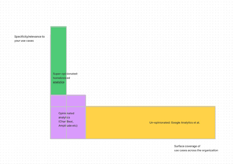
This nerdy debate connects to a bigger question in analytics: What do you get from the un-opinionated analytics tools you use? What do you get from the opinionated tools you use? And what do you do about the gap of intelligence that neither covers? My view is that this is where home-brewed analytics come into play — or, put another way, home-brewed analytics are the most opinionated tools you will use in your descriptive analytics.
So INMA is going to dive a bit into some of the upsides and downsides of these types of tools in the weeks ahead.
I have to caveat: There may be some hot takes. But then, your own hot takes on this week’s topics are also welcome. I may circle back to some of these in the next installment of our topic in the coming newsletter, so please do write back to me and let me know just what hill you think is the right hill to die on.
Also do tell me whether this type of post — which is less about a specific media company than a data-related problem that cuts across companies — is of interest to you in the first place. I wouldn’t want to shortchange anyone of case studies.
My e-mail is ariane.bernard@inma.org, just a tap of a button away.
Unopinionated analytics tools
The head of data at a large American media group was telling me last week: “The journey starts with descriptive analytics. How do you bring that together so you can accurately answer the question, ‘What happened?’ It requires common language, storytelling …”
The words that hit me there were “common language, storytelling.”
Because the question of “what happened” is something you can find in a good un-opinionated analytics tool. Was there a click? Was there an event recorded? Who came from where? You can get all of this from your standard analytic tool.
But the storytelling, that’s often not easy to find in our analytics toolbox. Or rather, it’s built in certain tools but not others.
Context, storytelling — for descriptive analytics tools — are usually trend lines and baselines (more rarely, scores). It is when the tool says, “This information relative to that information is the meaningful thing.” It’s when the user interface of that tool comes strong to put a big number up top that says: “This one is the big one,” and by definition the other ones are less of a focus for the humans.
Even so, context may still be opaque. The way a baseline is constructed, for example, may not be transparent to the user of the analytics tool. To say nothing of edge cases. We’ll get to this later.
But in any event, you don’t really get this out of the box from some of the most common analytics tools we use. Pretty much every company out there uses one large unopinionated analytics suite as the foundation of their analytics — and that’s often Google Analytics. Sometimes, it’s Adobe Analytics. When we do get more of this context from our analytics solutions, it’s usually because we’re using a more opinionated tool.
What’s that, an opinionated analytics product?
(Puts on product manager hat.)
In software products, there’s a style of product called “un-opinionated.” These are the products that are light on defining specific personas or limiting use cases for the usage for the product. Un-opinionated products try to cover “all the possible contexts in which you may need our class of product.”
A classic example of an un-opinionated product is Microsoft Word. As a product, it tries to serve “any need around word processing.” From printed flyers to macros, Microsoft Word tries to cover all possible use cases.

Meanwhile, at the other end of the spectrum in the same category of products, you have Google Docs, a very opinionated product: Google Docs’ first filter is: “a very simple experience of online Word processing for your everyday digital document writing needs.” Because “a very simple experience” is high in its brief, Google Doc does a lot less than Microsoft Word. While the two products have obvious overlap in users, circumstances of usage, and features, they stand with very different philosophies for what the product is relative to its user market.
Why does this matter? Un-opinionated products tend to come with more transparency in their set-up, and fewer, if at all, assumptions of usage. That’s pretty much what makes them un-opinionated.
Unopinionated versus opinionated analytics tools
Now that we had this little moment of definition, the reason I bring this up is that analytics products come in un-opinionated and opinionated flavours.
The big analytics suites like Google Analytics are un-opinionated. They cover a whole range of possible users, companies, and goals that you may be trying to serve by heading into your Google Analytics suite.

So we are not going to be talking about un-opinionated analytics products here because they don’t have an inherent world view. How they are configured, the kind of views they give of data, is very much decided by the organisation that puts it in place or the individual user putting together a report.
You decide whether you want to see a number, a table of numbers, a trend line, a chart, a bar chart. You decide what constitutes a flow or a conversion. You’ll be tagging things by hand a lot on your site to support how you may want to understand your Web site usage. The analytics suite is just there to give you access to the data it may have — no assumptions of usage or relevance is built-in out of the box.
What does it mean for the storytelling point that our American data executive was making? It means that when we use un-opinionated analytics tools, we are going to be the ones to provide the narrative structure for contextualising the numbers we pull. There may be “bad data” or “misleading data” if we don’t understand the context for our own numbers.
But we are left to construct the frame of reference for the numbers — and, usually, we can provide these because we know our businesses. We know what KPIs to use as baselines and as worth tracking. We know what period of comparisons are meaningful for us. But we will have to work hard at it. And, importantly, this may fall quite a bit short of the kind of usefulness we may want to help our business.
Opinionated analytics products: easier learning curve and more consistency
Meanwhile, we have a whole other class in the opinionated analytics product category. And while these can provide a more friendly approach for the users of the suite — particularly for non-data folks — we have to remember that opinionated analytics tools essentially provide the narrative built-in. They come with forceful views of what numbers to pay attention to and for what purpose. They also make various assumptions about referentials (we will look at this later).

This is great to democratise data. This is also great when you consider that people go from one company to another and that having some consistency in how everyday tools work makes for more portable knowledge. Someone who goes from Company A to Company B will have to deeply learn the specific Google Analytics of their new company. Not GA itself, but everything in how GA was rigged, making your GA and my GA quite different.
There are also ways to opinionate (not a word) your un-opinionated analytics: Google Data Studio is basically an opinion layer on top of your un-opinionated pile of data. They provide the narrative that data analysts at your company think are useful to understand your data in the context of what is most useful for your business.
Notice one thing: Google Data Studio is a selected view of your data. It’s not all the data. This is where opinionated tools often do their best work: subtraction.
But for their ease of use and clarity of purpose, opinionated analytics tools also have areas of opacity. Think: ways in which the product proposes a very specific read of your data, a specific baseline, assuming that it’s right for you at all times.
The most data-literate in your organisation (usually, data analysts) will usually remember these caveats when they are using this type of tools. And they will be able to see when you are hitting the edge cases of this type of tool. But — and this is the paradox of these tools that are usually oriented at a broader user groups in the organisation — the more casual user is not going to necessarily detect when the opinions of the tools have led to these edge cases in the first place.
So, yes, the opinionated analytic tool came with much clearer context and storytelling for you. But on the other hand, its strong opinions can make edge cases harder to spot.
In our next newsletter, we will look at some examples of this from scenarios you may encounter in your own organisations.
Further afield on the wide, wide Web
One good read from the wider world of data: In my last newsletter, I dumped 20 pages of disheartening reading about all the ways in which we teach machines to be as horrible as humans. This week is poetry: How an engineer built a model to generate Haikus (and there’s a link to generate your own Haikus).
Dates for the diary
We just wrapped last week the Smart Data Initiative master class focused on transforming what we build using data. We looked at more personal products and experiences, data to enable innovation and drive change, as well as privacy and first-party data.
The Smart Data Initiative re-emerges on the INMA (virtual stage) May 10 for the data module at the INMA World Congress of News Media.
Then our Smart Data Master Class series continues in September with a deep look at transforming how we work using data. Stay tuned here for more details. And we will soon re-institute Webinar meet-ups for the broader INMA community, which you can look for here.
Meet the community
For each installment of this newsletter, I am hoping to introduce one member of the community in this space. Want to be featured here? A few questions here to get to know you better. Thanks.
About this newsletter
Today’s newsletter is written by Ariane Bernard, a Paris- and New York-based consultant who focuses on publishing utilities and data products, and is the CEO of a young incubated company, Helio.cloud.
This newsletter is a public face of the INMA Smart Data Initiative. You can e-mail me at Ariane.Bernard@inma.org with thoughts, suggestions, and questions. Also, sign up to our Slack channel.
Related Articles


Upcoming Events
-

04Sep Africa Product & Tech Summit
04 September 2025
-

11Sep First-Party Data Activation for Advertising Master Class
11-18 September 2025
-

22Sep Media Innovation Week
Dublin, Ireland
22-26 September 2025
-

22Sep Dublin Media Innovation Study Tour
Dublin, Ireland
22-23 September 2025
-

09Oct Newsroom Transformation Master Class
09-16 October 2025
-

20Oct Media Tech and AI Week
San Francisco, United States
20-24 October 2025
-

22Oct Silicon Valley Tech & AI Study Tour
San Francisco, United States
22-24 October 2025
-

05Nov Generative AI Town Hall
05 November 2025
-

06Nov Subscriber Acquisition Master Class
06-13 November 2025
-

12Nov Newsroom Transformation Town Hall
12 November 2025
-

19Nov Advertising Town Hall
19 November 2025
-

03Dec Subscriptions Town Hall
03 December 2025


