Digimeter scoring model, dashboard provide insights into stories at Kleine Zeitung
Ideas Blog | 01 March 2023

Dear News Publishers: At a first glance, how can you determine if an article on your Web site is successful? How can you compare the article based on your business goals with others while making it comprehensible for all stakeholders?
Those are questions we asked for quite a while before developing the Digimeter Scoring Model.

Where it began
We, the data team at Kleine Zeitung, were doing our best to satisfy the appetite for data within the newsroom. However, most analyses left us with a fragmented way of looking at content — we had several metrics, which gave us an overview of how it went (how many page views the piece generated, how often it was commented on, how many users were reading it, etc.), but when it came to comparisons, we felt lost.
We had to compare several different metrics for each article and weren’t happy with this solution.
We needed one KPI to rule them all — one KPI, which made it possible to say, “This article was more successful than another in fulfilling our company goals!”
To come up with our KPI, we knew we had to include several behavioural and conversion metrics and combine them. We started by collecting our most important goals and their way of measurement:

So we came up with four categories, which could be measured by four different metrics — the last step was to put them together to form one KPI.
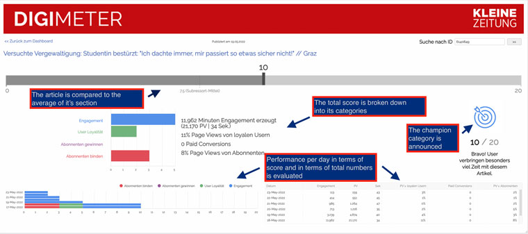
We ended up creating a score, which is comprised of the four categories (aka goals) above, where each can score up to five points, making 20 points the most a content piece can reach in Digimeter. Moreover, when an article receives five points in one category, this category is claimed as a “champion” and specifically pointed out by an image (as seen above).
Where we are
The dashboard not only gives us a place to turn when we need to look at the performance of a content piece, but it also indicates how the rest of the Web site performs on a certain day. We show the detailed report of a piece in relation to its section, list the individual score for each category/goal and day and the total numbers behind the score.
Thanks to the model, we could identify story types that do not work online (they were produced for print) and can be left out. We found that certain stories work well for the regional pages and that sports reviews can be summarised as detailed reports, as they were rarely read and scored zero points in most instances.
Based on the almost two-year-long journey with the scoring model, we have decided to revise the dashboard by integrating feedback and revising the current KPI calculation method.
To be continued!
Related Articles


Upcoming Events
-

11Sep First-Party Data Activation for Advertising Master Class
11-18 September 2025
-

22Sep Media Innovation Week
Dublin, Ireland
22-26 September 2025
-

22Sep Dublin Media Innovation Study Tour
Dublin, Ireland
22-23 September 2025
-

09Oct Newsroom Transformation Master Class
09-16 October 2025
-

20Oct Media Tech and AI Week
San Francisco, United States
20-24 October 2025
-

22Oct Silicon Valley Tech & AI Study Tour
San Francisco, United States
22-24 October 2025
-

05Nov Generative AI Town Hall
05 November 2025
-

06Nov Subscriber Acquisition Master Class
06-13 November 2025
-

12Nov Newsroom Transformation Town Hall
12 November 2025
-

19Nov Advertising Town Hall
19 November 2025
-

03Dec Subscriptions Town Hall
03 December 2025
-

04Dec Africa Audience Development Summit
04 December 2025


