Module system at Sydney Morning Herald, Age adds context, depth to articles
Digital Strategies Blog | 14 February 2022

We’re always trying to think of ways to better showcase our journalism and create a more engaging experience for subscribers.
Toward the end of 2020, our newsroom developers built a presentation hub for editors, producers, and reporters of The Sydney Morning Herald and The Age to add depth to stories. It allows them to easily create and embed modules such as document tear-outs, timelines, polls, and audio quote embeds to develop better digital products. More than 5,500 modules have been created.
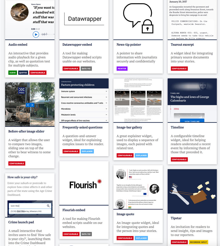
Before and after sliders and in-article galleries allowed imagery from our award-winning photographers to be better showcased. Plus, they assist in the narrative themselves.
For this article, we had 14 of the interactions between the 2021 Australian of the Year Grace Tame and Prime Minister Scott Morrison. The photo widget allowed us to enhance the story and display a series of images in chronological order, rather than be limited to one or two.

Recently we also used the tear-out function to embed top-ranked tennis player Novak Djokovic’s travel declaration form used to enter Australia amidst all the breaking coverage surrounding his visa saga ahead of the Australian Open.

These modules add more context to stories and allow information to be conveyed in a more digestible manner. Once created, the embed can be used in multiple articles to enhance the storytelling. If any changes need to be made, it is then refreshed across all articles where it features.
The presentation hub functionality is not limited only to hard news articles. It is also frequently championed in sporting blogs to create a dynamic reading experience and spark conversation with readers throughout the duration of a game.
Our 2021 NRL Grand Final live blog is one such example. Sports journalists and editors used the poll functionality throughout the game at key moments and during decisive plays.

We know fans love to interact throughout big matches, and they have a lot to say when it comes to their favourite teams and players.

Separate from the presentation hub, our premium content team has recently developed a number of interactives to better service readers.
Ahead of the summer and Christmas holidays in Australia, the emerging Omicron wave made the never-ending state and territory border woes harder to navigate. Differing COVID-19 case numbers dictated different rules around vaccination and test status. This interstate planner allowed readers to see what documentation was needed prior to travel.

The concept was simple, but the result is a serviceable product for our subscribers that can be easily updated as rules change.
Another such example was our close contact interactive test we developed in light of changes announced in the national cabinet, where the prime minister and state and territory leaders meet to discuss the latest COVID measures.
There were a lot of moving parts and variables to the new conditions, so we decided the best way to visualise and convey this information was in the form of a flowchart-style quiz. That way readers could quickly find out — without having to read through all the fine print — if they had to isolate or not and what next steps were required.

These elements significantly enhance our journalism and provide a valuable service to our subscribers. The data can be translated across different digital platforms, and easily edited and reimagined to adapt to the changing nature of news.
Related Articles
-

AI excels as a reporting tool but not as a reporter
6 August 2025 -

E-commerce gives news companies a blueprint for personalising U...
29 July 2025 -

Video project helped La Nación understand audience, platform ne...
27 July 2025 -

Reuters Institute research details the new rules of the news ec...
2 July 2025


Upcoming Events
-

11Sep First-Party Data Activation for Advertising Master Class
11-18 September 2025
-

22Sep Media Innovation Week
Dublin, Ireland
22-26 September 2025
-

22Sep Dublin Media Innovation Study Tour
Dublin, Ireland
22-23 September 2025
-

09Oct Newsroom Transformation Master Class
09-16 October 2025
-

20Oct Media Tech and AI Week
San Francisco, United States
20-24 October 2025
-

22Oct Silicon Valley Tech & AI Study Tour
San Francisco, United States
22-24 October 2025
-

05Nov Generative AI Town Hall
05 November 2025
-

06Nov Subscriber Acquisition Master Class
06-13 November 2025
-

12Nov Newsroom Transformation Town Hall
12 November 2025
-

19Nov Advertising Town Hall
19 November 2025
-

03Dec Subscriptions Town Hall
03 December 2025
-

04Dec Africa Audience Development Summit
04 December 2025


